SURFACE DESIGN
product design | illustration | retail trend forecasting | copywriting | hand lettering | print proofing


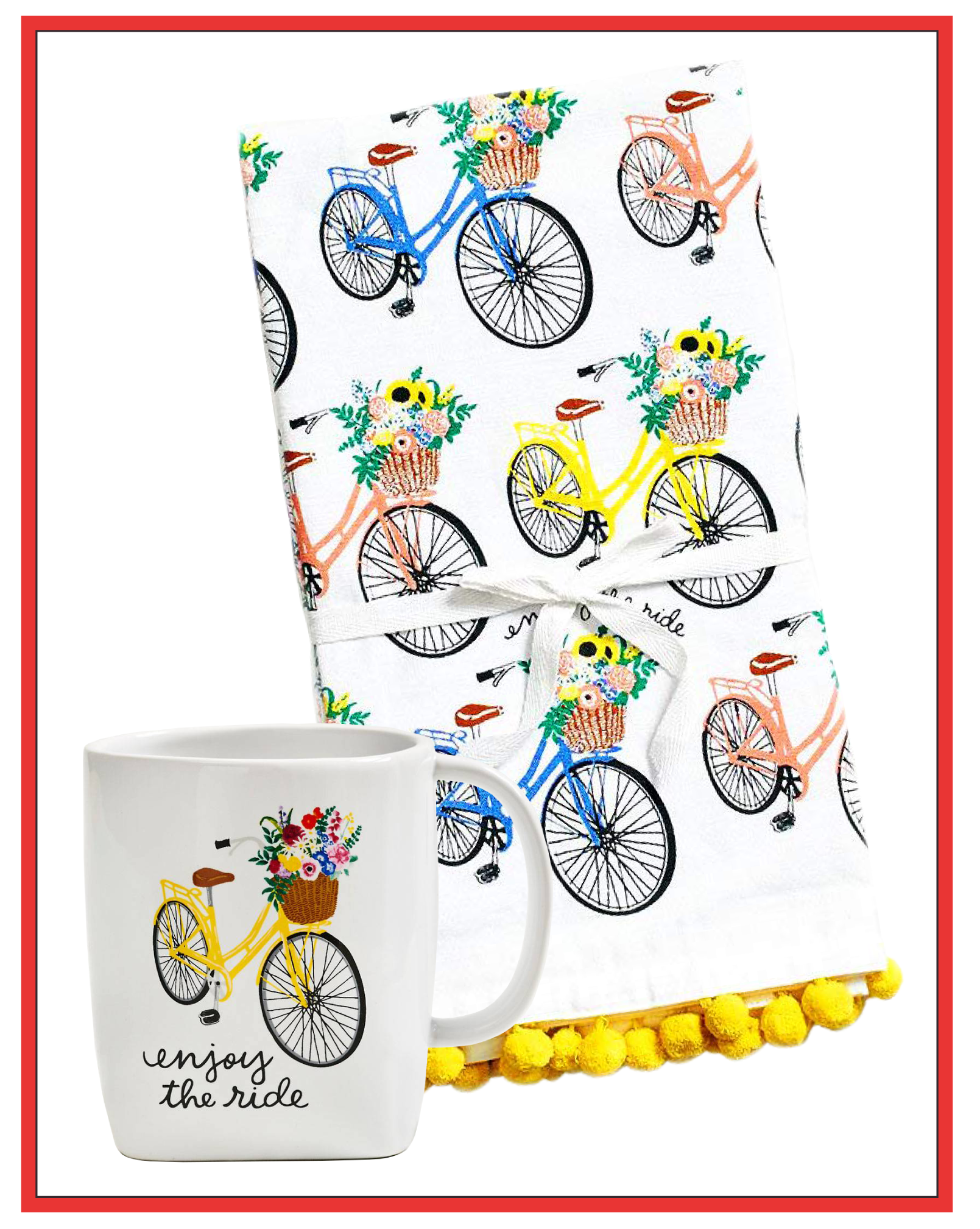
As a surface designer, I developed artwork, designs, and copy for application on seasonal and core products for a retail chain. These items included calendars, planners, cards and stationery, gift products, gift wrap, totes, tea towels, banners, craft supplies, and invitations.


Happy Howl-idays
Hero print for holiday seasonal products. Best selling new Paper Source exclusive design in roll wrap, with over 150K in seasonal sales.
Storefront window display for all 130 Paper Source stores nationwide.


Blending Design + Copy
Greeting cards- one of my favorite product categories to design! In order to capture the maximum number of sales, we would sub-categorize the market by sender/recipient relationships and then by sentiment. Take Mother’s Day, the largest card-selling holiday of the year, for example- we would design cards for mothers, new mothers, pregnant people, grandmothers, and people who act “like a mom” to the card-giver. From there, we would further segment by card giver- from partner, from young child, from adult child, from grandchild, from friend. Within these categories, I would write multiple types of sentiments, from sweet to snarky, straightforward to sappy, and design them appropriately. Father’s Day was my favorite holiday to write and design for, because I got to write and design so many punny cards!
Cards also offered an opportunity for me to try out different design and illustration styles, since they didn’t need to be entirely cohesive with the gift products in store, so long as the style and voice were consistent with the brand.

In this role, I utilized market research & historical sales data to forecast trends across various product lines and markets to present to executive leadership. Exclusive artwork and designs are a major point of differentiation for retail, allowing companies to charge a higher price than a more basic piece of similar quality. The unique artwork is also more difficult for copycats to imitate.
This ‘Smoky Watercolor’ series was a hero design for calendars, planners, and back to school products. The technique was one of my own creation, developed through experimentation with physical materials (stone watercolor paper, powdered watercolors, ink) and later perfected and color adjusted to match other seasonal products in Photoshop.
Designing in Three Dimensions
Though much of my work was applied to surfaces two-dimensionally, I sometimes had the opportunity to work in three dimensions. For these Halloween and Easter totes, I developed unique felt bag forms and utilized existing PS artwork for the faces to coordinate with existing seasonal merchandise. I then relayed all dimensions and felt color selections to our overseas vendor and performed quality control inspections on the samples.
The cursive “celebrate” banner was a particular challenge, as each letter was individually die-cut. The string needed to pass through each letter several times to ensure a sturdy hold, but the vertical placement of the holes had to be high enough so that the letter wouldn’t tip forward from being too top-heavy. Additionally, the tail of each individual letter needed to connect seamlessly into the following letter to achieve a true cursive feel, without affecting the horizontal weight distribution.
This banner ended up being such a success that I was asked to create a full cursive alphabet for all stores to utilize with their CriCut machines, enabling them to die-cut customers’ names on demand for in-store workshops.
Banners
Designing banners was an exercise in taking typography- a traditionally two dimensional element- into three dimensions. For additional pizazz and as an added differentiation from past seasons’ banners, I coordinated with our manufacturers to incorporate elements like champagne bottles popping gold tinsel fizz, or cascading silver stars.


